HW 6 (Plotting climate data)
Assignment overview
There are Python packages that allow us to plot graphs, just like what you might do in Excel. In this assignment, you'll practice using lists to create coordinates for a set of 2-dimensional data points, and then plot these points. I'll provide the starter code that constructs a plot (given data that's properly formatted), your responsibilities is (1) to load in the data from a file and get it into the correct format for plotting, and (2) using my code as a template, create another plot of your choice.
Specifically, we'll be looking at historic climate data from the MSP airport.
Goals
Practice reading from files, using lists, and making plots.
Logistics
This is an individual assignment. You are welcome to discuss any part of the assignment with classmates, course staff or Anna. Make sure to cite any help you receive in the "acknowlegdements" portion of the assignment.
This assignment is due at 10PM on Friday, May 1.
Setup
Mount the COURSES drive and create a folder called hw6 in your STUWORK folder.
Open the new folder in VSCode.
If you need a refresher on how to complete these steps, refer back to the in-class
lab from the first day of class.
Download the starter code
and move the two files, climate.py and mspData.csv into your hw6 folder.
If you are working on your own computer, you'll need to install the Python package matplotlib. To do
so, run the following command from the terminal:
pip3 install matplotlib
If that doesn't work, you can try pip install matplotlib instead. If that still doesn't work, reach out
for help, and in the meantime, work on the lab computers.
Explore the starter code
Python file: climate.py
You will add all of your code to climate.py. I already have starter code for many of the function you'll
need. Here's what you'll find:
mainspecifies the filename and calls the other functions we need to load in, process, and plot the data.parseDatawill read each line from the file and will add the results to a set of lists. You need to complete the missing code in this function.getMonthDatawill filter your dataset to only include data from a specific month. You need to complete the missing code in this function.plotMonthTempswill create a plot that contains two line plots on the same axes. For both graphs, the x-axis will be years and for the y-axis, one line will be the average daily maximum temperature and the other will be the average daily minimum temperature.
For this assignment you'll also need to create one additional plot of your choice. I haven't created that function for you since different people will choose to plot different data.
Data: mspData.csv
This file contains monthly climate data from the MSP airport from April 1938 to April 2026. Each row contains the average high temperature, average low temperature, total precipitation, total snowfall, and average snow depth for one month. For example, the first row (with numbers rounded to the nearest thousandth for readability) is
1938,04,62.955,41.182,3.27,0.0,0.0
which means that in April (i.e., month "04") 1938, the average high was 62.955 degrees F, the average low was 41.182 degrees F, there were 3.27 inches of liquid precipation and 0 inches of snow, and the average snow depth was 0 inches.
Write parseData
I recommend creating a smaller data file (e.g., using only the first 5-6 lines) to use during testing.
Fill in the missing code in the parseData function. The core of this function should be a loop using
readlines that iterates over each line in the data file. Within the loop body, you'll need to use
string manipulation to separate out the different parts of the data, and then use list indexing and mutation
to add the correct pieces of data to each of the lists we return.
Note that the first line in mspData is a header, meaning it doesn't contain data. You'll have to figure
out a way to skip over this line when populating the lists in parseData. One way (but certainly not the only way)
to do this is to make use of the python keyword continue, as illustrated in the following for loop:
# example of continue. Code will print 0, 1, 2, 4, 5
for i in range(5):
    if i == 3:
       continue # go to the next loop iteration now
    print(i)
After writing parseData, be sure to test it. Creating a smaller data file and then printing the variables
and manually checking is a great way to do this. Another option is to print out the
length of the variables years, months,
minTemps, and maxTemps in main (they should each have 1057 items) and to print out the first few
elements of each variable and check that they match the first few items in in the data file.
Note 1: there exist libraries for automating CSV processing in Python, you should not use those libraries here.
Note 2: depending on your operating system, you may need to explicitly tell your computer what encoding to use when
reading from the file. If you get any unexpected errors when testing parseData, try modifying the code that opens the file
to open(filename, "r", encoding="utf-8").
Write getMonthData
In the next part of this assignment, I am going to ask you to plot the data for all the years in the dataset,
but only for the month of May. That means we have to create new versions of the years, minTemps, and maxTemps
list that only contain data for the month of May. The starter code calls getMonthData from main to create
new variables for you, but you have to fill in the missing code in getMonthData.
Your basic strategy will be to iterate through monthList, and whenever monthList[i] (where i is your loop variable)
is the specified month, you should also add otherList[i] to newList.
Check that plotMonthTemps works
I've already written plotMonthTemps for you. Run the code after completing the previous two parts and check that the
following image is produced:
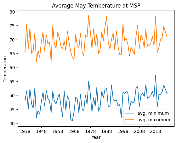
The graph should show up in a popup window. You need to close this window for the code to continue executing.
Create another plot of your choice
What else could we plot with the data? For this part of the assignment, you'll create one more plot of your choice. Feel free to be creative, but here are some ideas:
- Plot the average snowfall, snow depth, or rainfall per year (could be the average per year, or the average for a given month)
- Plot the average temperature, snowfall, or rainfall by month for a given year.
- Plot the average temperature each month for a multi-year period (I recommend limiting to a 5-10 year period so that your graph is still readable)
- Plot the change in temperature between all successive months (again, you'd likely want to limit yourself to a few-year timespan or else do the change in the average across all months)
All of these ideas are (likely) line plots, but you can also create bar plots or other graph styles if you wish!
Depending on what plot you create, it may be sufficient to only slightly modify the code from plotMonthTemps.
But if you have more ambitious ideas (or just want to understand what is going on), feel free to reference and
cite the matplotlib documentation. A good
strategy is to find an image of a graph similar to the one you want to create, and then look at that example code
to try to figure out how to do a similar thing for your situation.
It's possible that you'll need to edit parseData to create and return additional variables. Feel free to do so!
You will likely also want to create a new helper function to do data preprocessing (similar to getMonthData) and a
new function to plot the graph (similar to plotMonthTemps).
When you create your new plot, make sure you update the title and the axis labels to be descriptive.
Optional extension
Create more plots!
Wrap up
When you're finished, make sure to complete the usual documentation steps. This includes adding comments, writing function docstrings, and adding a top-level comment, acknowledgements, and a reflection to the header.
You should also think about coding style. Have you written everything in a consistent way that is easy to read? Does your code have any unnecessary print statements? (Remove them.) Is there any repetitive code that could be rewritten to use loops or functions? Review the style document on Moodle for the expectations for this assignment.
Assignment submission and misc. notes
Handing in the assignment
You need to hand in climate.py on Gradescope.
Grading
This assignment is worth 40 points, broken up as follows:
parseData11 pointsgetMonthData11 points- Creating another plot of your choice 12 points
- Style 6 points: header, comments, code organization, following the style guidelines from Moodle.
Start early, ask lots of questions, and have fun!
Anna's acknowledgements
This assignment was adapted from assignments used by Layla Oesper and Tanya Amert. Thanks for sharing!